Анимированный скролл на чистом CSS
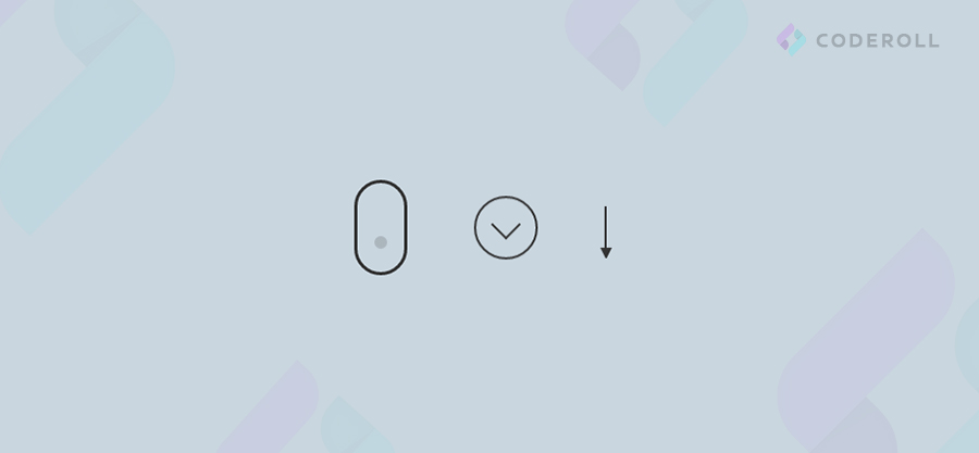
Совсем недавно мы разбирали, что такое ссылка-якорь и как сделать плавную анимацию к блоку по клике на эту ссылку. В этом уроке поговорим о создании анимированной кнопки-скролла для привлечения пользователя вашего проекта к какому либо действию.
Шаг 1.
Делаем разметку для нашего скролла.
Шаг 2.
Стилизуем наш анимированный скролл в виде иконки при помощи CSS.
Шаг 1.
Делаем разметку для нашего скролла.
<div class="field">
    <div class="mouse"></div>
    <div class="scroll"></div>
    <div class="arrow"></div>
 </div>
Шаг 2.
Стилизуем наш анимированный скролл в виде иконки при помощи CSS.
.field {
  display: flex;
  align-items: center;
  justify-content: space-around;
  width: 300px;
  position: absolute;
  top: 50%;
  left: 50%;
  transform: translate(-50%, -50%);
}

.mouse {
  width: 50px;
  height: 90px;
  border: 3px solid #fff;
  border-radius: 60px;
  position: relative;
}

.mouse::before {
  content: '';
  width: 12px;
  height: 12px;
  position: absolute;
  top: 10px;
  left: 50%;
  transform: translateX(-50%);
  background-color: #fff;
  border-radius: 50%;
  opacity: 1;
  animation: wheel 2s infinite;
  -webkit-animation: wheel 2s infinite;
}

@keyframes wheel {
  to {
    opacity: 0;
    top: 60px;
  }
}

@-webkit-keyframes wheel {
  to {
    opacity: 0;
    top: 60px;
  }
}

.scroll {
  width: 60px;
  height: 60px;
  border: 2px solid #fff;
  border-radius: 50%;
  position: relative;
  animation: down 1.5s infinite;
  -webkit-animation: down 1.5s infinite;
}

.scroll::before {
  content: '';
  position: absolute;
  top: 15px;
  left: 18px;
  width: 18px;
  height: 18px;
  border-left: 2px solid #fff;
  border-bottom: 2px solid #fff;
  transform: rotate(-45deg);
}

@keyframes down {
  0% {
    transform: translate(0);
  }

  20% {
    transform: translateY(15px);
  }

  40% {
    transform: translate(0);
  }
}

@-webkit-keyframes down {
  0% {
    transform: translate(0);
  }

  20% {
    transform: translateY(15px);
  }

  40% {
    transform: translate(0);
  }
}

.arrow {
  width: 0;
  height: 40px;
  border: 1px solid #fff;
  position: relative;
  animation: scroll 1.5s infinite;
  -webkit-animation: scroll 1.5s infinite;
}

.arrow::after {
  content: '';
  display: block;
  position: absolute;
  top: 100%;
  left: -5px;
  width: 1px;
  height: 10px;
  border-top: 10px solid #fff;
  border-left: 5px solid transparent;
  border-right: 5px solid transparent;
}

@keyframes scroll {
  0% {
    height: 40px;
  }

  30% {
    height: 70px;
  }

  60% {
    height: 40px;
  }
}

@-webkit-keyframes scroll {
  0% {
    height: 40px;
  }

  30% {
    height: 70px;
  }

  60% {
    height: 40px;
  }
}HTML/CSS
23.05.20, 11:06